Creative Care Club

Creative Care Club is a bi-monthly subscription system developed under ArtMonkee, designed for creatives who feel disconnected from their practice due to burnout, overstimulation, or constant pressure to produce.
This project began with a simple observation. Most creative systems today are built to optimize output. They prioritize speed, consistency, and visibility. While this works for productivity, it often works against the way many creatives actually think and feel.
I wanted to explore what happens when design moves in the opposite direction. Instead of asking how to make people create more, this project asks how to make it easier for them to begin again.
Creative Care Club is structured as a physical, two-drawer artefact that arrives every two months. Each delivery combines grounding elements with a beginner-friendly creative activity, creating a complete experience that requires no preparation, no prior skill, and no expectation of outcome.
The project brings together brand identity, packaging design, artefact development, content direction, and experience strategy. Every decision, from material choices to microcopy, is designed to reduce pressure and create a sense of ease.
This is not positioned as therapy or self-help. It is a system of creative support.
The Problem
Through both personal experience and observation, I noticed a recurring pattern among creatives, especially students and early professionals.
They begin projects with intention but struggle to continue. They feel overwhelmed by constant exposure to high-quality work. They associate creativity with output, and over time, that association becomes heavy.
Design culture reinforces this. Most tools, platforms, and workflows are built around performance. There is an expectation to produce something finished, something shareable, something good. This creates a disconnect. Creativity becomes something that needs to be justified rather than something that can simply exist.
The issue is not a lack of ability. It is a lack of space.
This project responds to that gap by shifting the role of design from output-driven to experience-driven. Instead of helping users create better work, it focuses on helping them reconnect with the act of making itself.
Insight
The key insight that shaped the direction of this project is that burnt-out creatives are not looking for more tools. They are looking for permission.
Permission to:
- create without finishing
- start without knowing the outcome
- engage without comparison
- take breaks without guilt
Most creative kits and resources still operate within a productivity framework. They guide users toward results, improvement, or skill-building.
Creative Care Club intentionally steps away from that.
It replaces instruction with reassurance. It replaces outcomes with process. It replaces pressure with presence.
This shift informed not just the concept, but every design decision that followed.
Concept
Creative Care Club is designed as a studio-led subscription model where each drop acts as an extension of ArtMonkee’s philosophy.
Instead of functioning as a product line, the system behaves more like a recurring studio output. Each box explores a specific emotional or creative state, such as feeling stuck, feeling overwhelmed, or needing to slow down. The structure remains consistent across every drop, but the content evolves. This creates a rhythm that feels predictable but not repetitive.
Consistency builds trust. Variation keeps the experience engaging.
The intention is to create something that users can return to, not because they need it, but because it feels safe to. This approach also allows the system to scale while maintaining a strong conceptual foundation.
Design Strategy
The design strategy is built around reducing the barriers that prevent people from engaging with creativity.
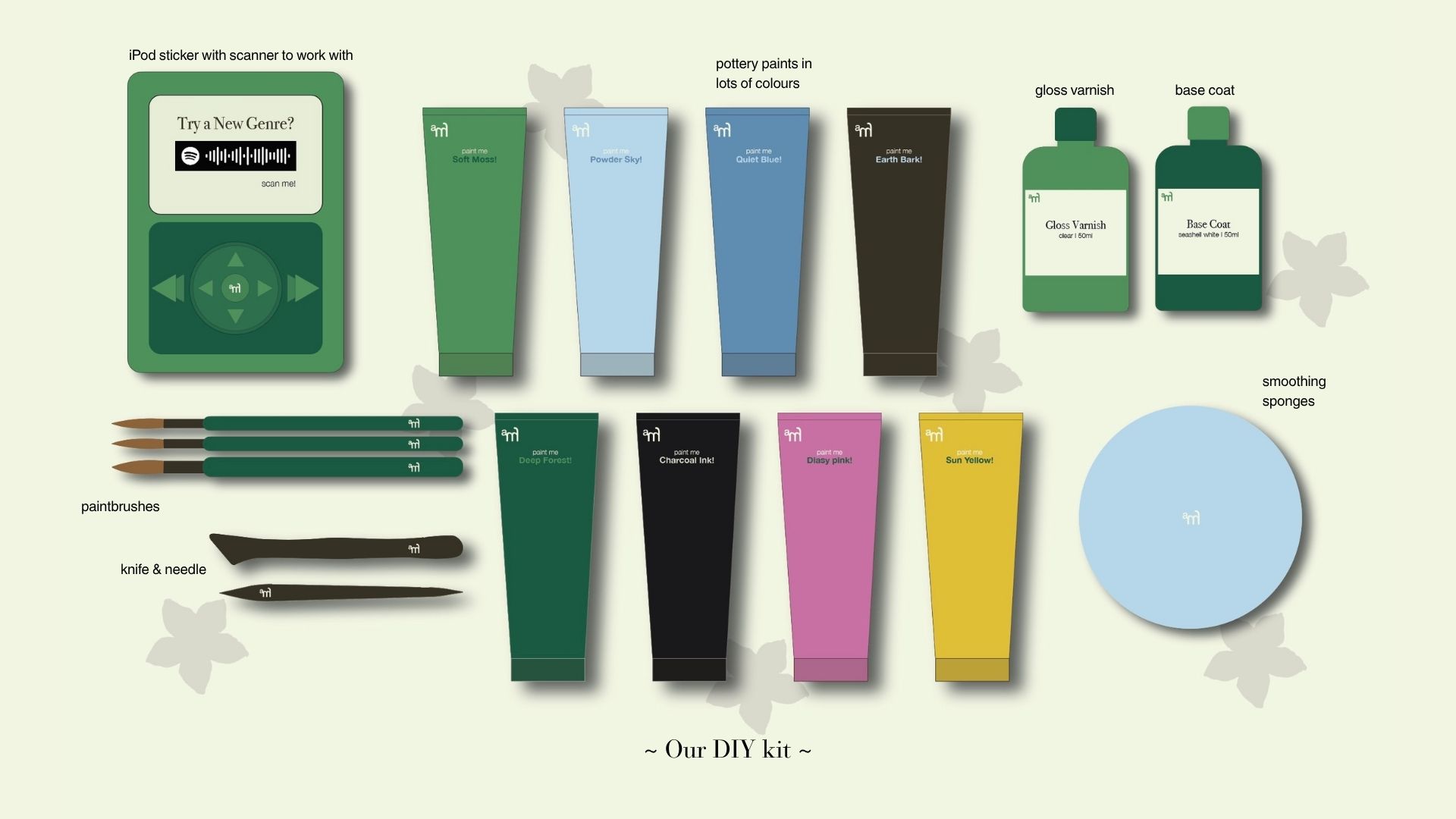
Reducing friction was the first priority. Every kit includes all materials required to begin. There is no need to purchase additional tools, search for references, or prepare anything in advance. This removes the hesitation that often stops people before they start.
Removing pressure was equally important. The system avoids any language or structure that suggests a “correct” outcome. Instructions are written as guidance rather than steps to follow. The goal is to support the process, not control it.
Encouraging presence shaped the overall experience. The use of physical artefacts shifts attention away from screens and into tactile interaction. This slows down engagement and creates a more intentional relationship with the activity.
Together, these principles transform the experience from something goal-oriented into something exploratory.
Audience
The primary audience for this project is young creatives navigating early stages of their careers or education.
They are:
- emotionally aware but mentally exhausted
- highly exposed to digital content and comparison
- inconsistent in their creative practice due to burnout
- drawn to slow living, tactile experiences, and self-reflection
The creatives engages with creativity as a way to process emotions but struggles with the pressure to produce something meaningful every time. This understanding directly informed decisions around tone, structure, and level of guidance.
Rather than simplifying the experience, the system respects the user’s emotional complexity and designs around it.
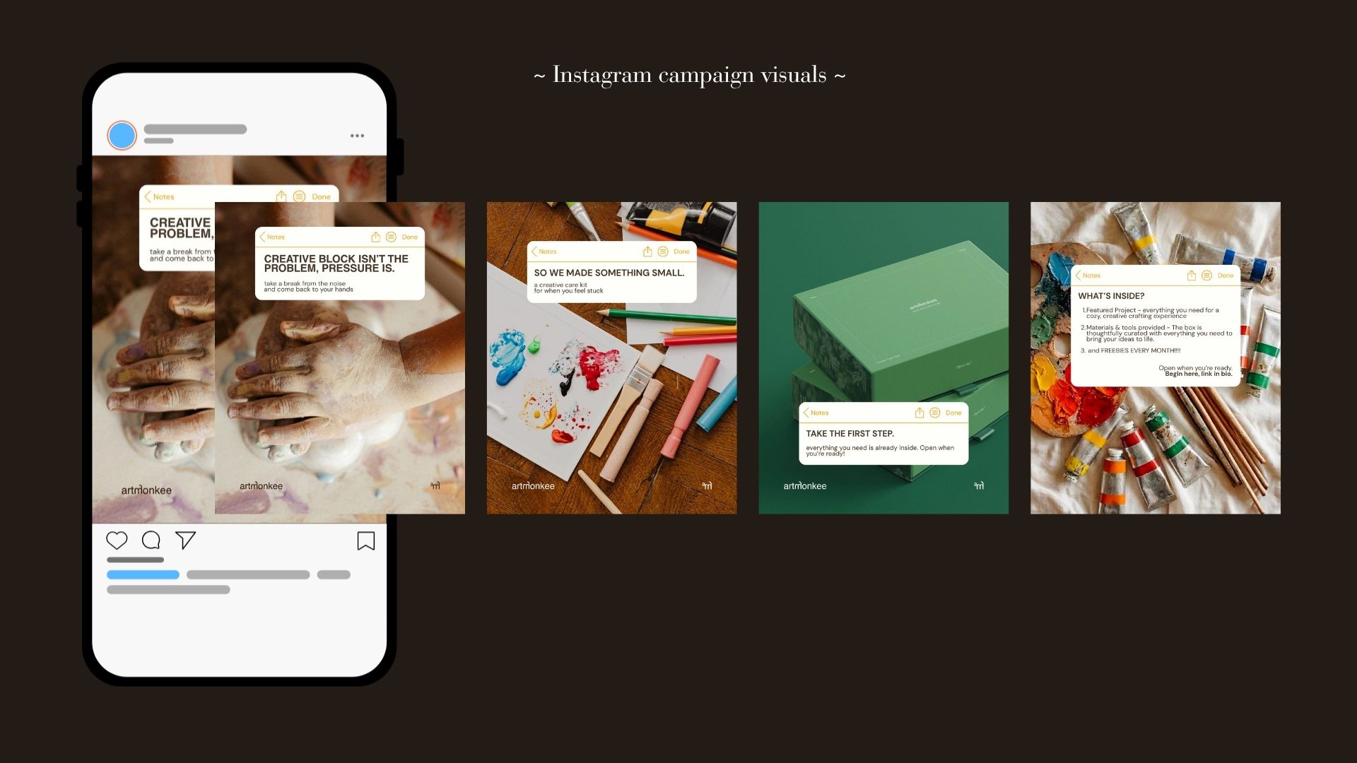
Brand Language & Tone
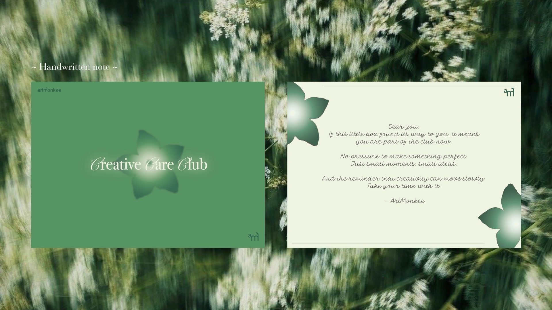
The verbal identity is intentionally soft, calm, and human. It avoids authoritative language, rigid instruction, and anything that feels prescriptive. Instead, it speaks in a way that feels like a quiet presence rather than a directive voice. The tone is built around reassurance.
Lines like
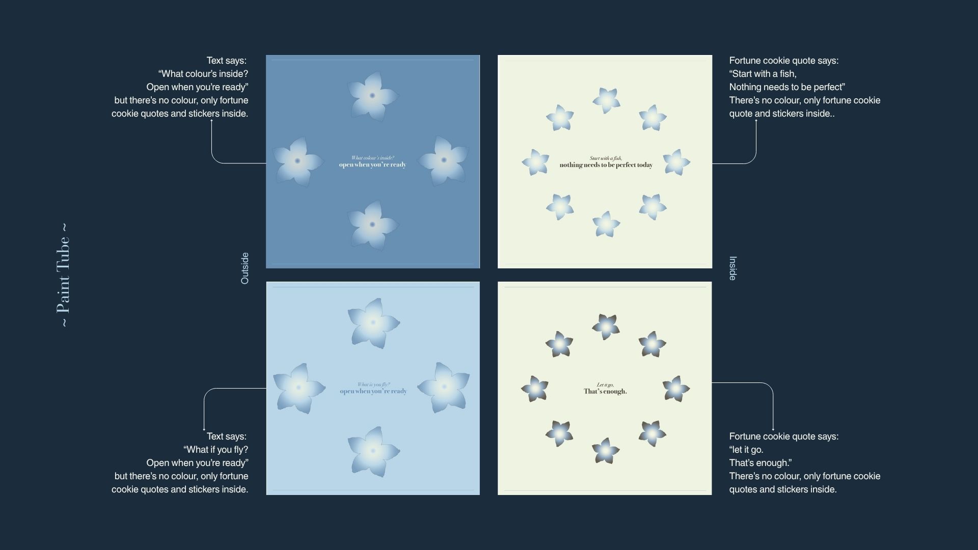
“Start with a fish. Nothing needs to be perfect today.”
are not just copy. They are part of the experience.
They reduce hesitation, lower expectations, and create emotional entry points.
This tone is applied consistently across all touch points, including packaging, inserts, and digital content, ensuring that the brand feels cohesive and intentional.
Visual Identity System
The visual system is designed to feel grounded, breathable, and emotionally supportive.
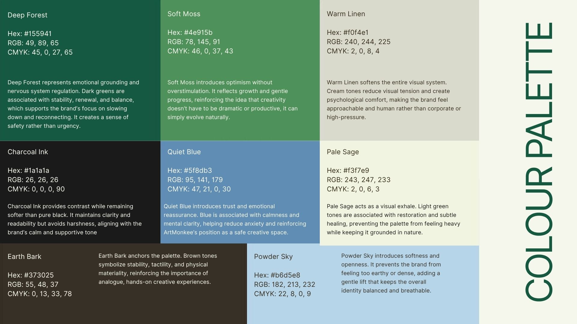
The colour palette is built using greens, blues, and earth tones. Each colour is selected based on its psychological association.
- Dark greens create a sense of stability and grounding
- Browns reinforce tactility and connection to physical materials
- Soft blues introduce calm and clarity
- Light neutrals reduce visual tension and soften the overall experience
Typography balances structure and emotion. Serif elements introduce softness and expression, while sans-serif fonts maintain clarity and readability. This balance reflects the core idea of the project. It is structured enough to function as a system, but soft enough to feel personal.
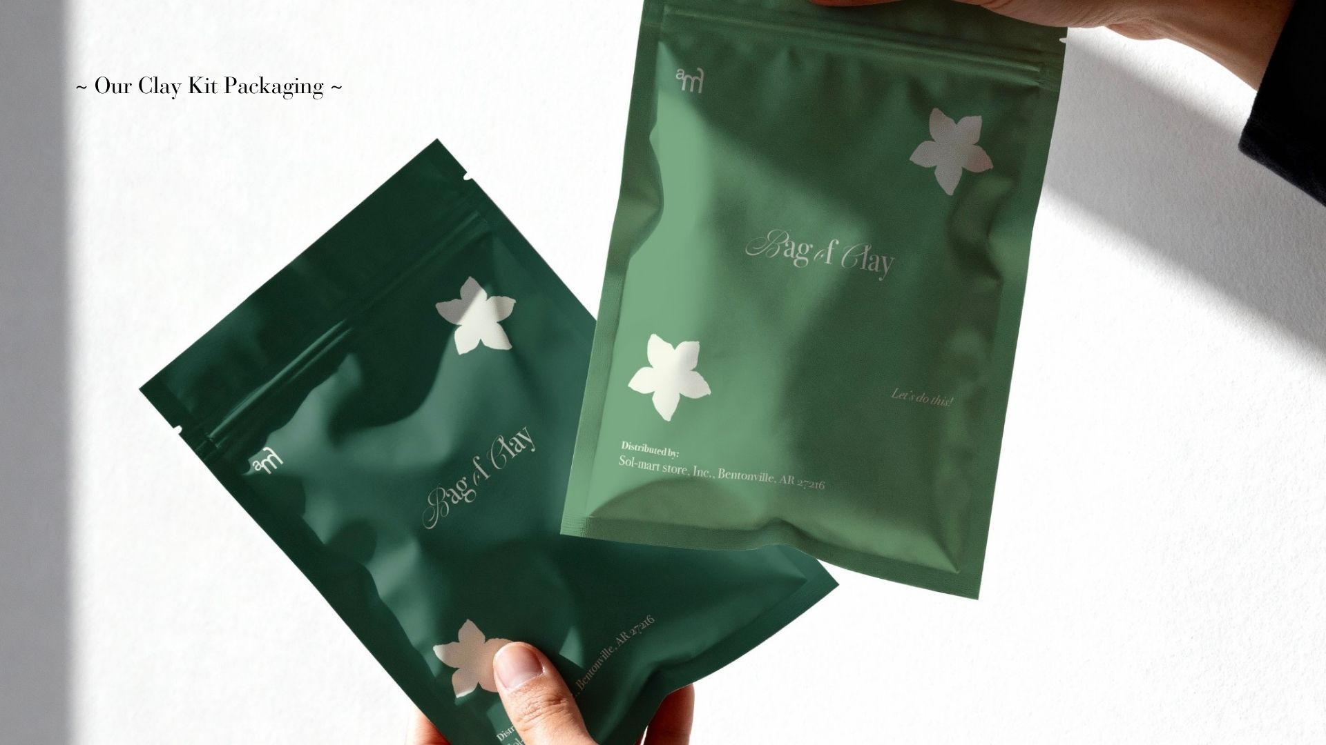
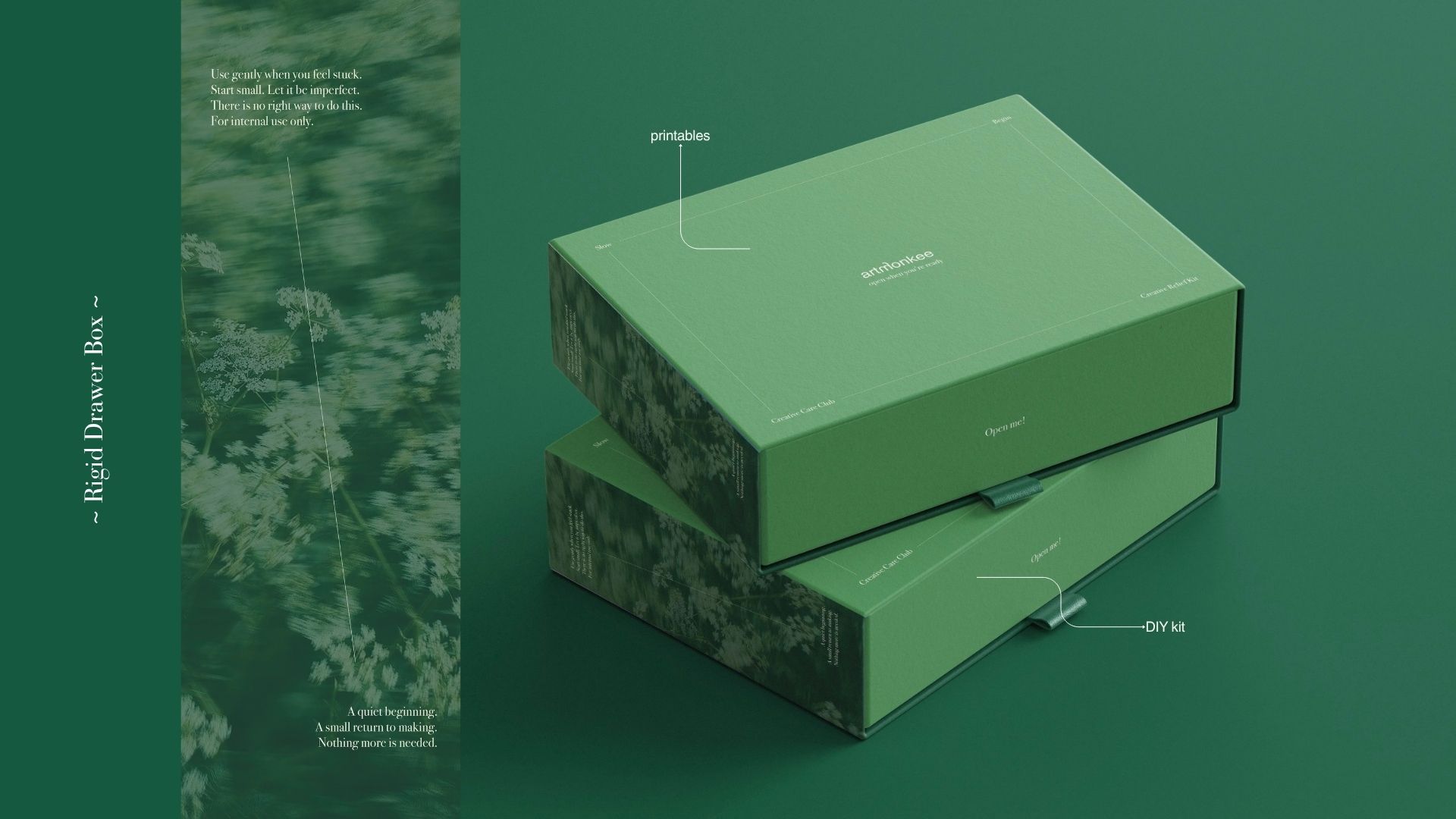
Packaging System
The packaging is designed as a rigid two-drawer box to create a layered experience.
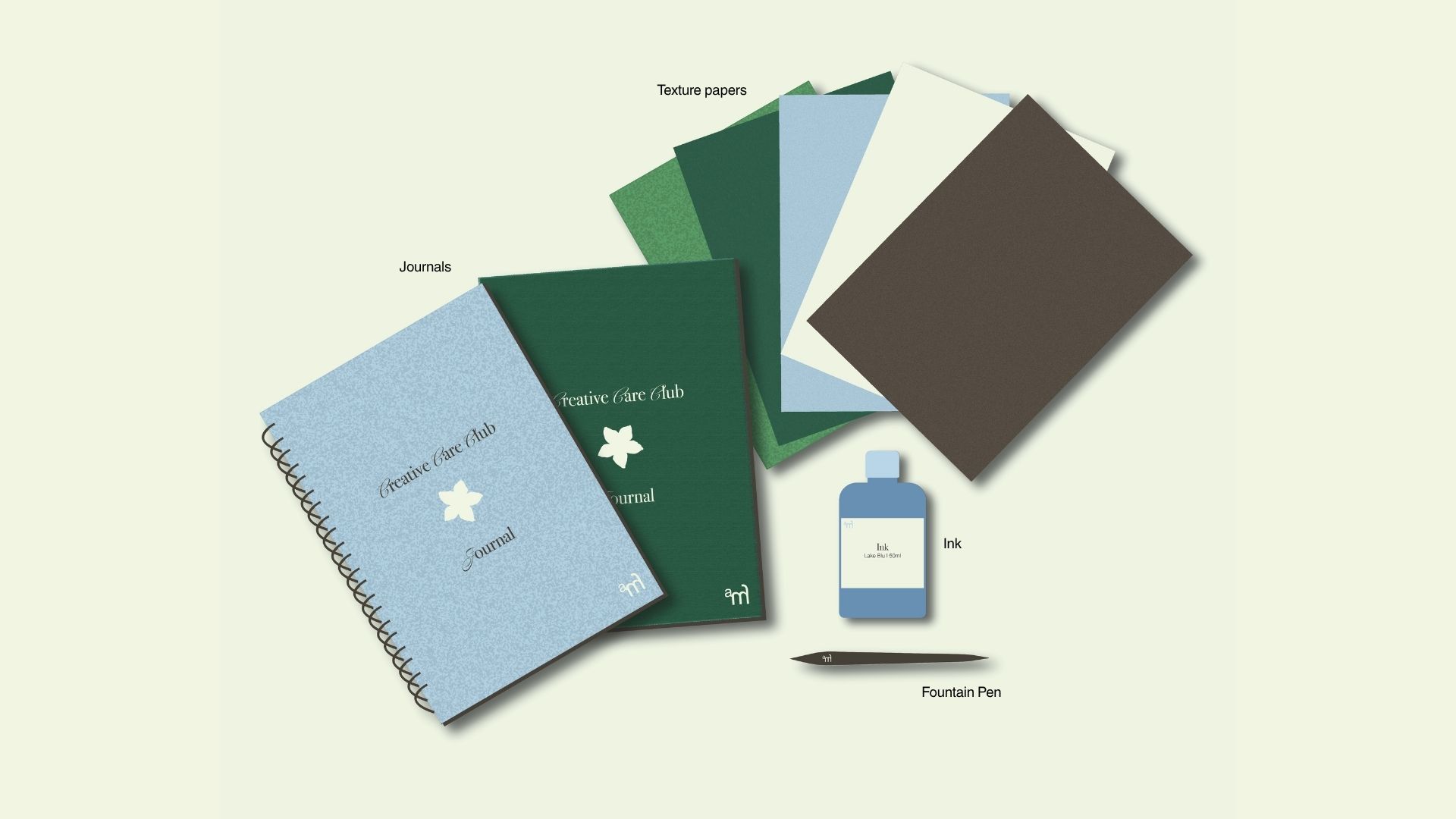
The top drawer contains what I refer to as the non-negotiables. These are the elements that remain consistent across every drop but different theme everytime. They include printed materials, small artefacts, and grounding tools designed to create a sense of familiarity and emotional safety.
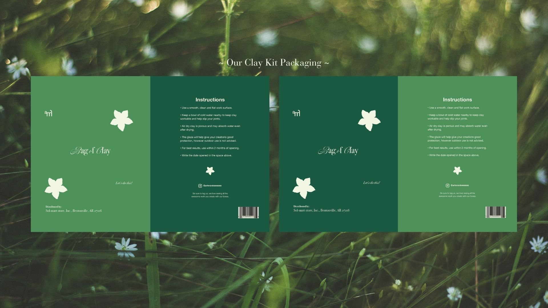
The bottom drawer introduces the DIY creative kit. This section changes with each drop and contains a complete activity with all materials included.
This structure allows the system to do two things at once.
It creates consistency, which builds trust over time. And It introduces variation, which keeps the experience engaging.
The physical act of opening the drawers also becomes part of the experience, slowing down interaction and encouraging intentional engagement.
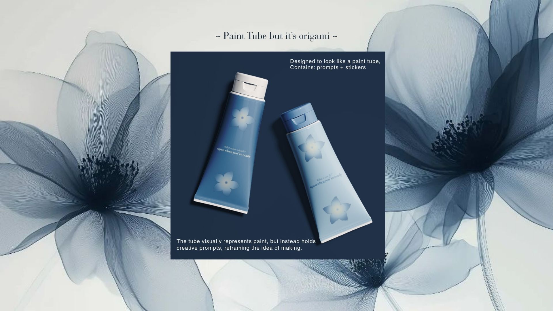
Key Artefact: Paint Tube
The paint tube is the central conceptual object in this project.
It is designed to look like a traditional paint tube, creating an immediate visual association with creativity. However, when opened, it does not contain paint. Instead, it holds prompts, messages, and small interactive elements.
This contrast is intentional.
The object subverts expectation. It challenges the idea that creativity must begin with materials or skill. Instead, it begins with thought, curiosity, or even hesitation. The tube acts as a transitional object. It sits between not starting and starting. It does not demand action. It invites it.
This small shift changes the way the user approaches the entire experience.
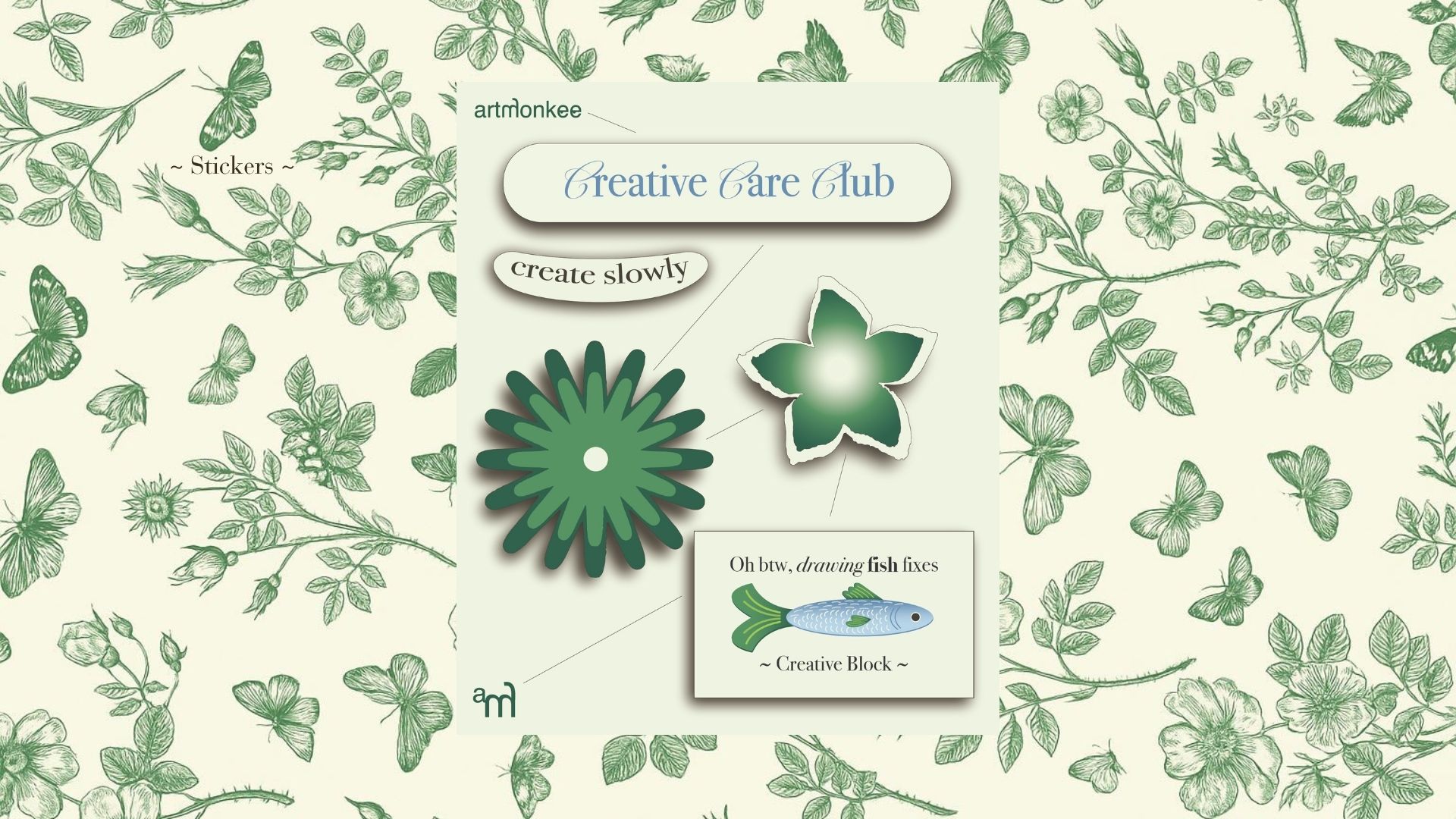
Supporting Artefacts
Every supporting element in the box is designed to reinforce the core idea.
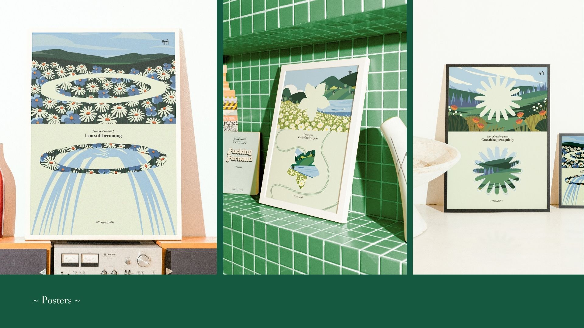
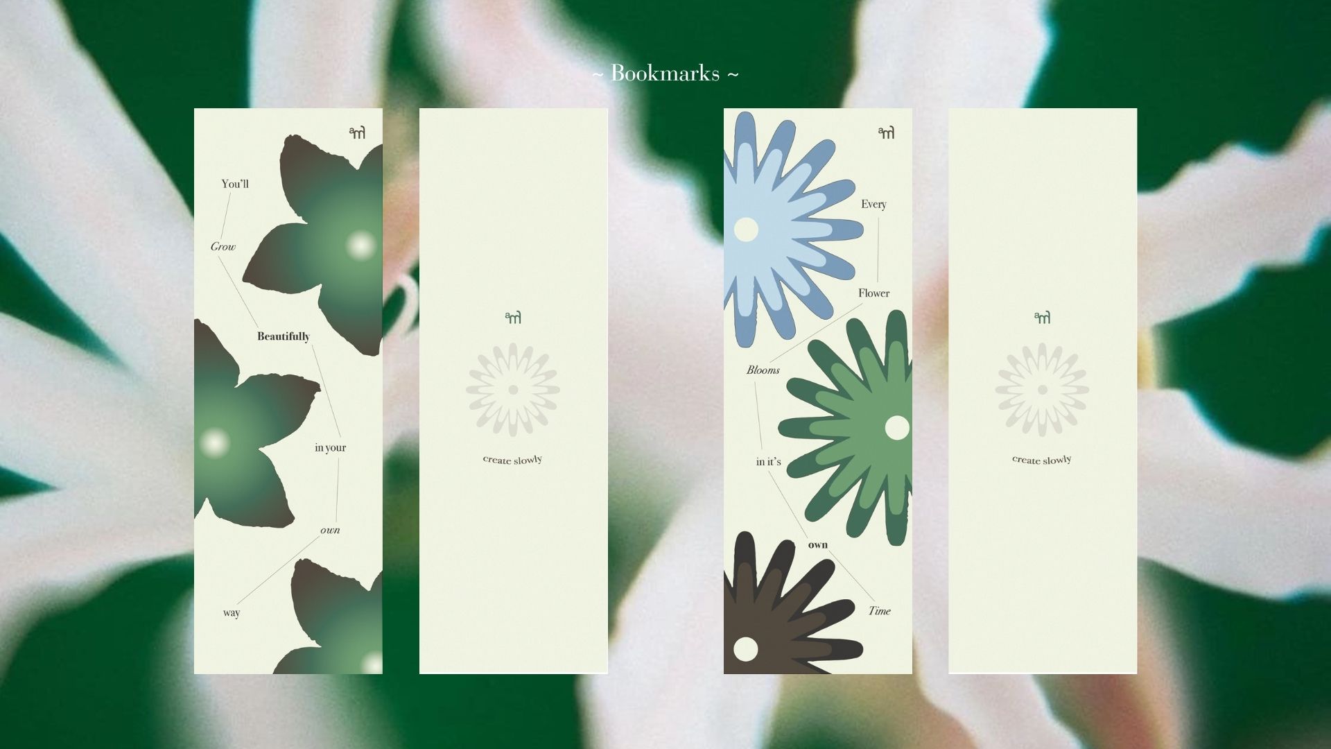
Posters act as quiet visual anchors that can exist beyond the box.
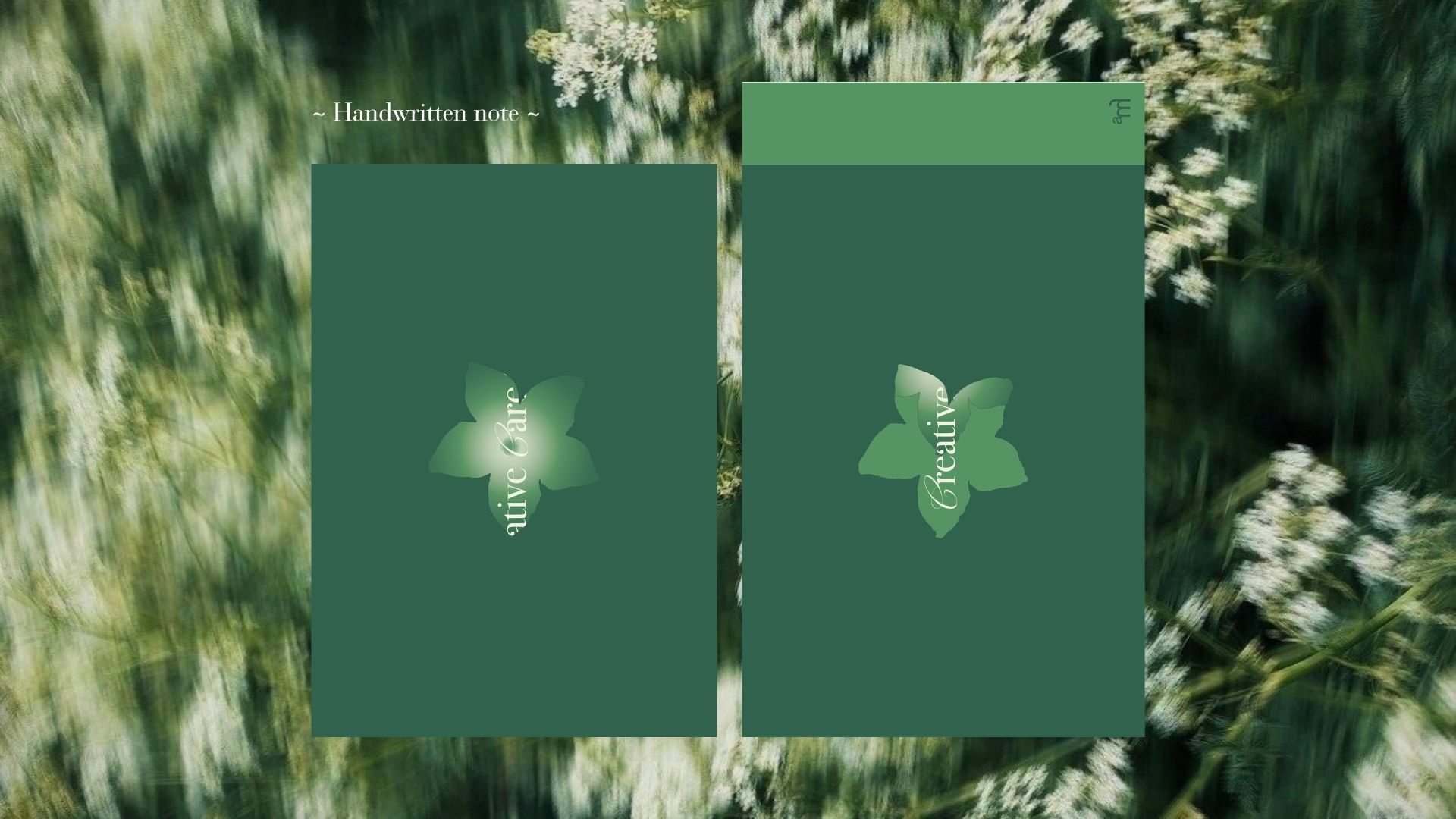
Handwritten notes introduce a personal, human touch.
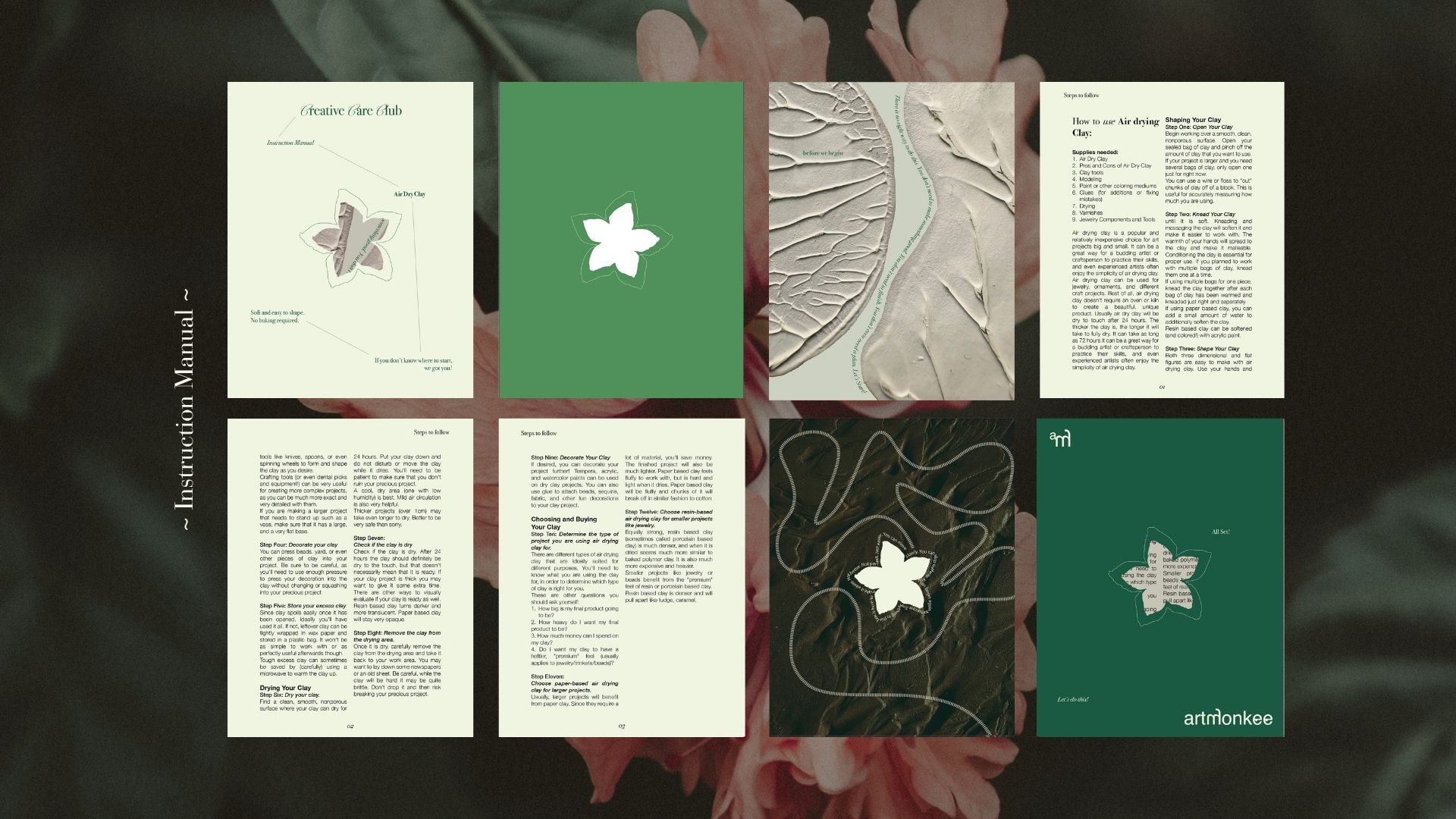
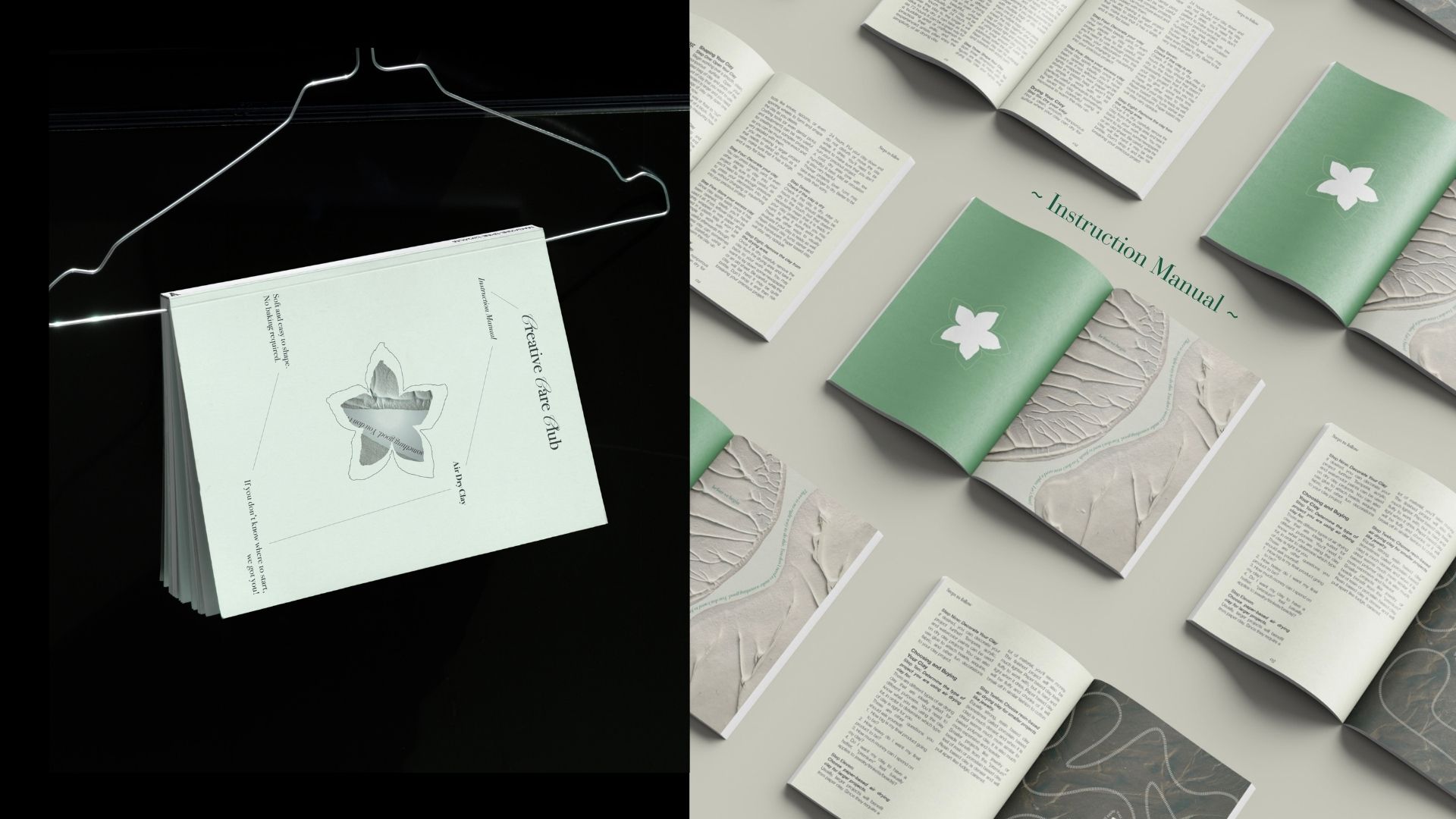
Stickers and bookmarks extend interaction into everyday life.
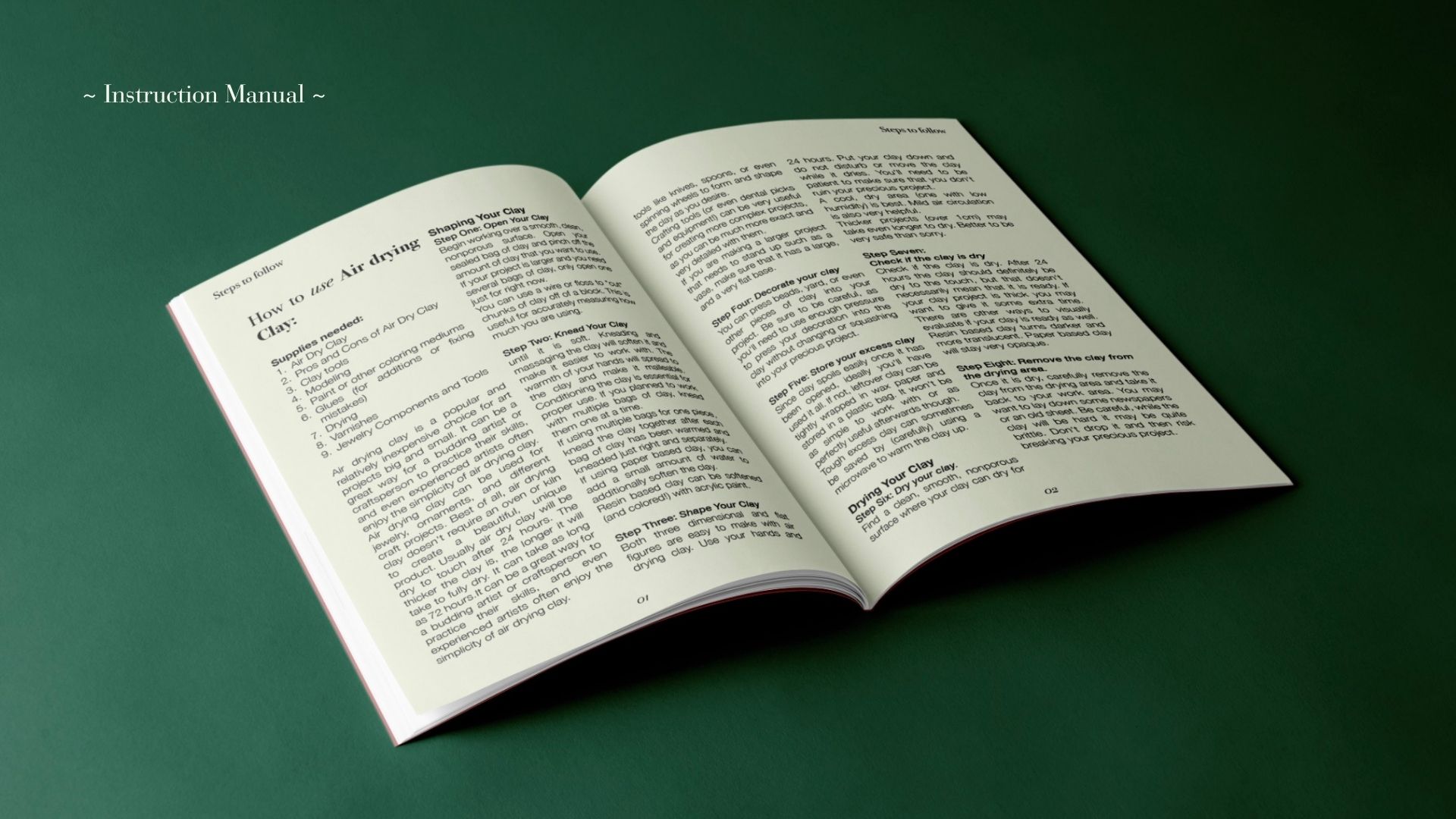
Instruction booklets provide guidance without enforcing structure.
These elements are not treated as add-ons. They are considered parts of a larger system.
Together, they create multiple entry points into the experience, allowing users to engage at their own pace.
Outcome
Creative Care Club demonstrates how design can function beyond visual output.
It shows how a system can be built around emotional needs rather than just functional ones. The project positions ArtMonkee as a studio that creates experiences, not just artefacts. It opens up possibilities for future drops, evolving systems, and deeper engagement with a creative community.
More importantly, it redefines what success looks like.
The goal is not to create something impressive.
The goal is to make it easier to create at all.
Challenges & Iterations
One of the biggest challenges in this project was resolving the tension between concept and clarity.
A key example of this was the paint tube artefact. Visually, it strongly resembled a real paint tube, which created an expectation of function. However, conceptually, it was designed to hold prompts and messages instead of paint.
This mismatch initially created confusion. The object was being read literally, while the intention was more symbolic.
To resolve this, I had to rethink how the object communicates its purpose. Instead of changing the form entirely, I focused on clarifying its role through naming, microcopy, and surrounding context. The tube became less about mimicking a tool and more about reframing the idea of starting.
Another challenge was maintaining a balance between structure and softness.
Because the system is designed to feel calm and non-prescriptive, there was a risk of it becoming too vague or lacking direction. At the same time, introducing too much structure would contradict the core idea of pressure-free making.
This required careful decisions around instruction design, tone of voice, and visual hierarchy. Every element had to guide without controlling, which meant constantly refining how much information to include and how it was presented.
There were also practical considerations around scalability. Since this is designed as a subscription model, the system needed to be repeatable without losing its emotional value. This influenced decisions around packaging structure, material choices, and the modular nature of the artefacts.
Each challenge pushed the project to become more intentional, both conceptually and functionally.
What I Learned
This project changed how I approach design at a fundamental level. I moved from thinking about design as something that is seen, to something that is experienced over time. I learned how to build a system instead of a single output. Every component, from packaging to copy to interaction, had to work together to support a consistent idea. This required a deeper level of thinking beyond aesthetics.
I also developed a stronger understanding of emotional design. Instead of asking what looks good, I started asking what feels safe, what feels approachable, and what removes hesitation. This shift influenced decisions around color, typography, pacing, and language.
Another key learning was around restraint. Not every element needed to be expressive or complex. In many cases, simplifying the experience made it more effective. Removing pressure required removing excess.
I also became more confident in defending conceptual decisions. Projects like this can easily be misunderstood if they are only evaluated visually. Learning how to articulate intent, especially when the outcome is not purely functional, was an important part of the process.
Overall, this project helped me understand how design can shape behavior, not just visuals.
Conclusion
Creative Care Club is not just a product or a packaging system. It is an exploration of how design can support people in a more human way.
The project reframes creativity as something that does not need to be productive, visible, or perfected to be meaningful. By building a system that reduces pressure and encourages presence, it creates a different kind of relationship between the user and the act of making.
For me, this project represents a shift in practice. It moves away from designing for outcomes and towards designing for experiences, emotions, and long-term engagement. It also establishes a foundation for how ArtMonkee can evolve as a studio. Not just as a place that creates visuals, but as a space that builds systems people can return to.
This is something I see continuing beyond this project, both as a concept and as a direction for my work.

Let’s talk
Design & Business.
Let’s make impact.