Branding
Vero Stash
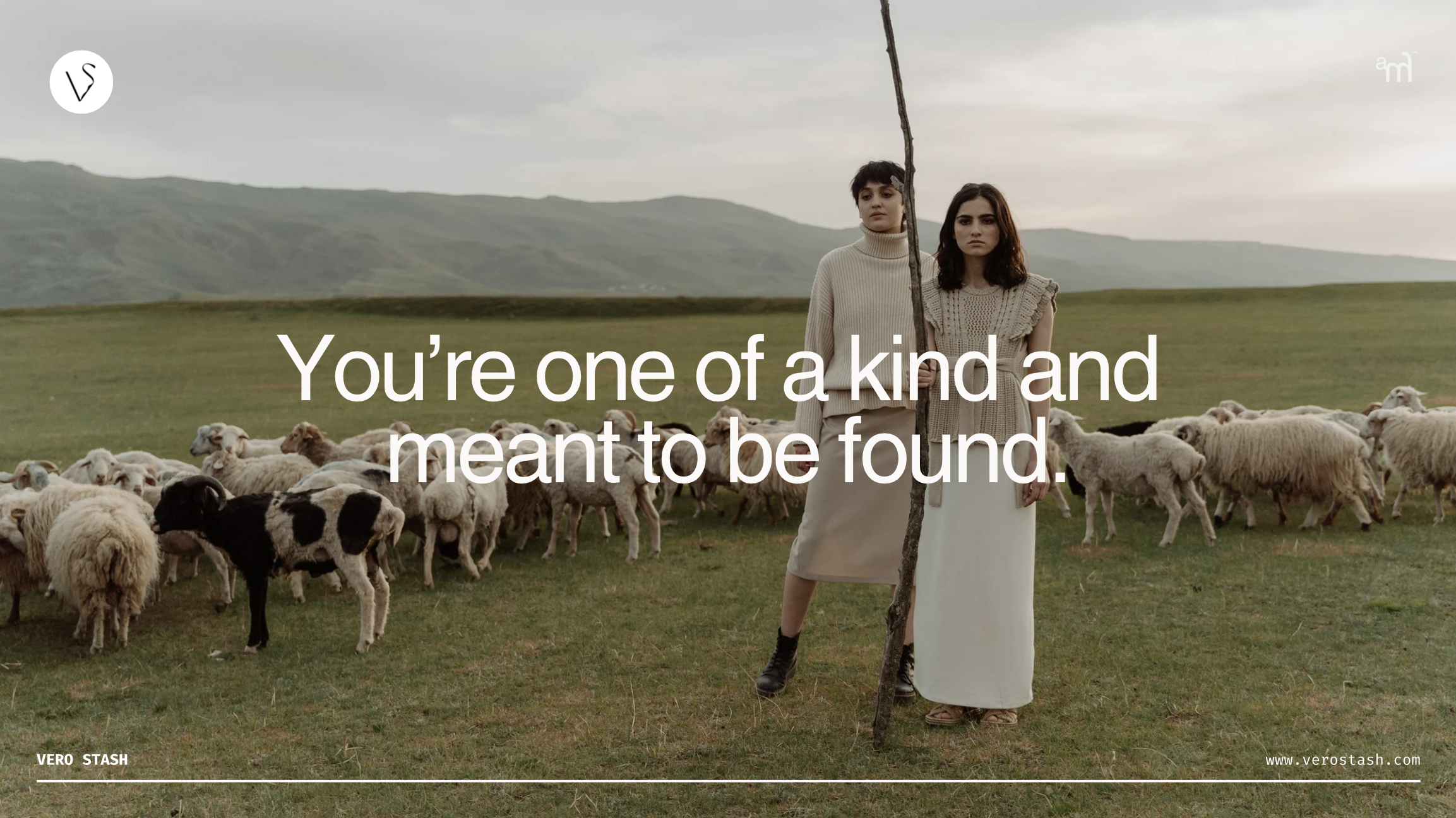
The storyGiving secondhand fashion a bold personality.
Vero Stash isn’t just a thrift store; it’s a statement. The goal was to create a brand identity that felt bold, rebellious, and effortlessly stylish—aligning with the edgy, curated thrift experience Vero Stash offers.
We played with a mix of nostalgia and modern aesthetics, bringing together vintage elements, bold typography, and raw textures to create a brand that speaks to fashion risk-takers.
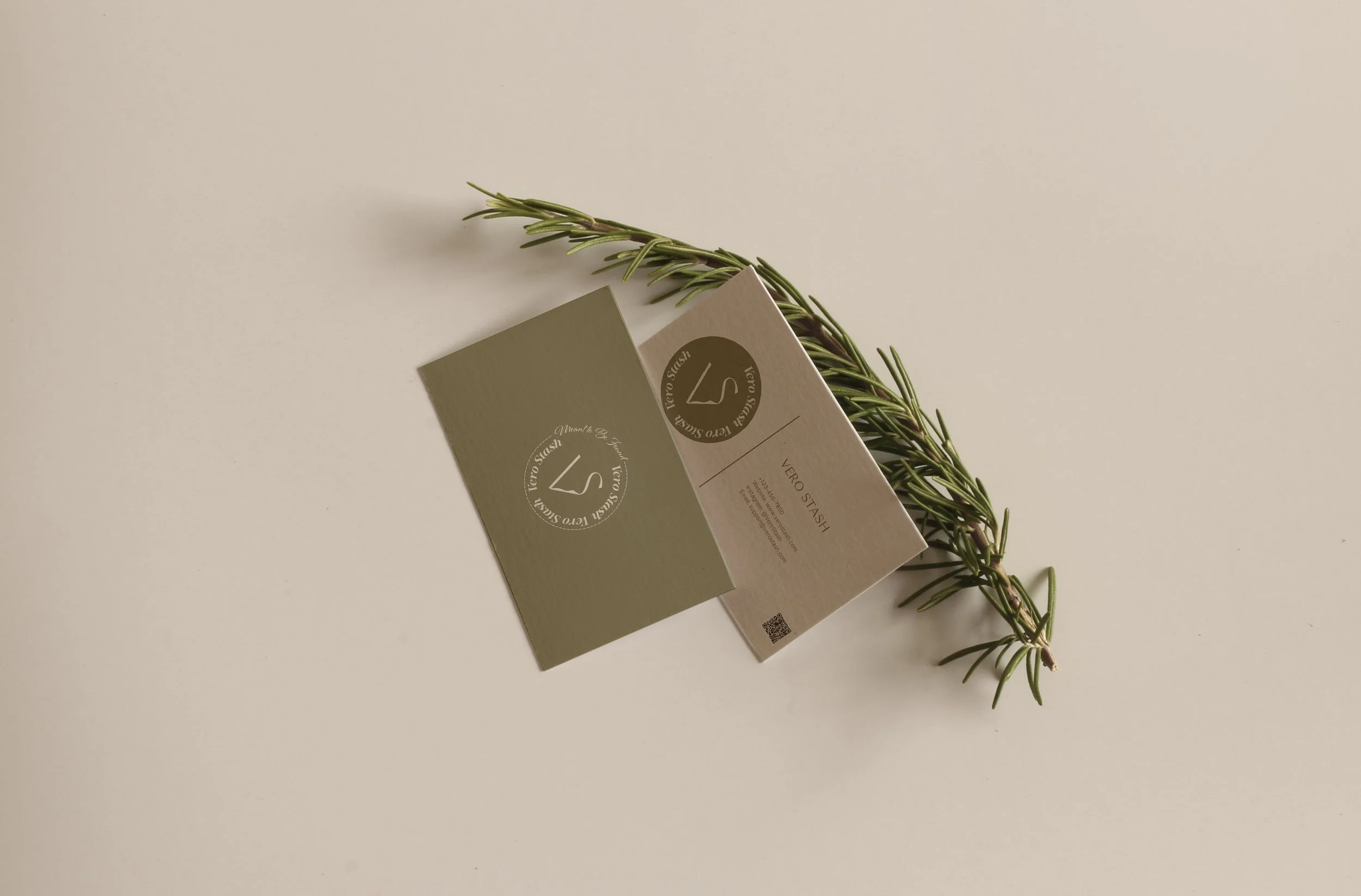
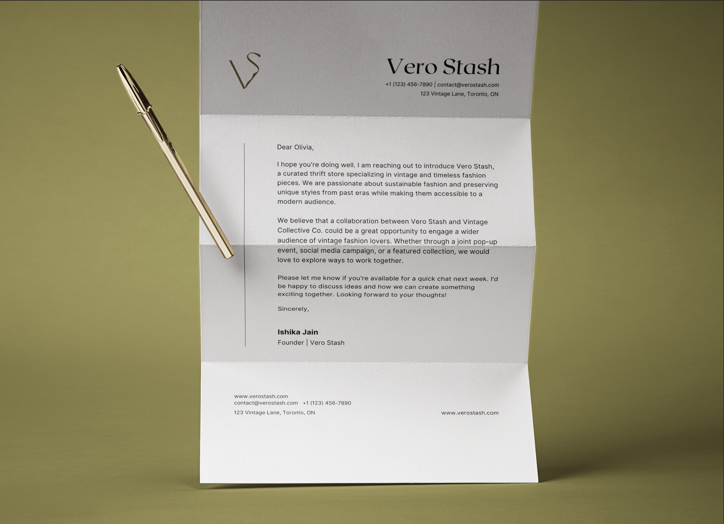
Establishing strong fundations in brandingFrom the logo to the colour palette, every element was crafted to reflect authenticity and individuality. The primary font, Stella Aesta, adds a bold yet playful touch, while Al Fresco complements it with a natural, handwritten feel for the tagline.
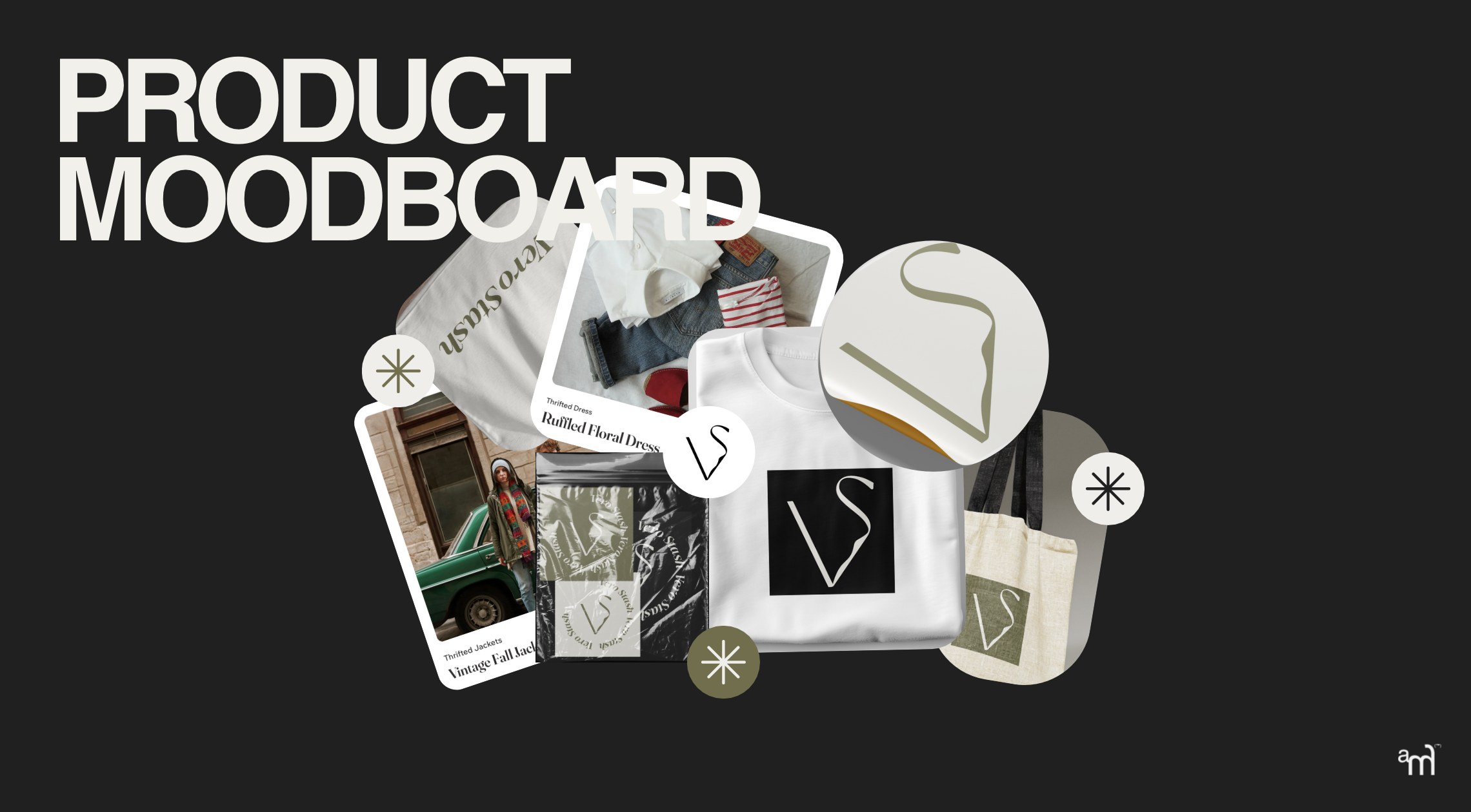
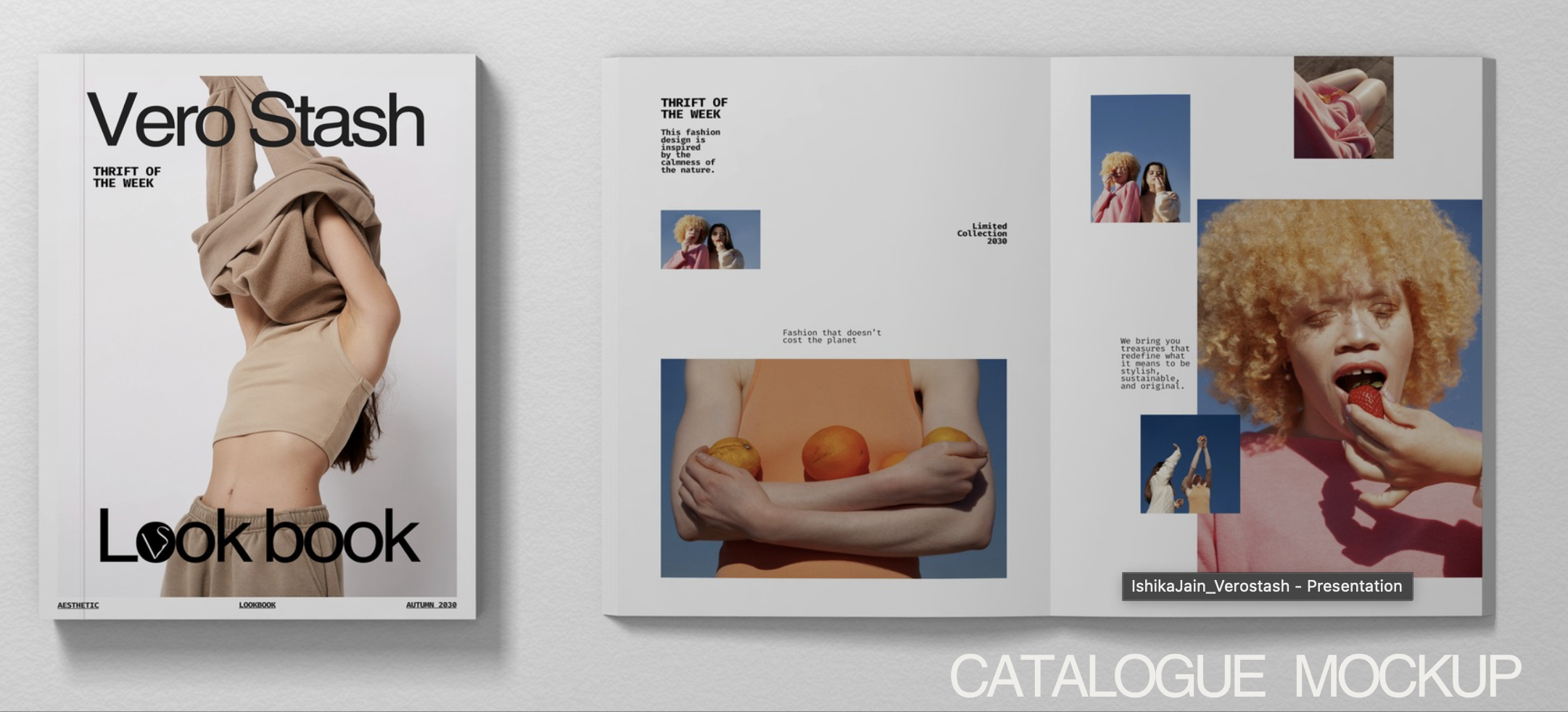
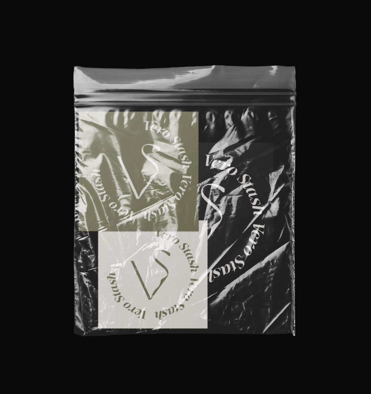
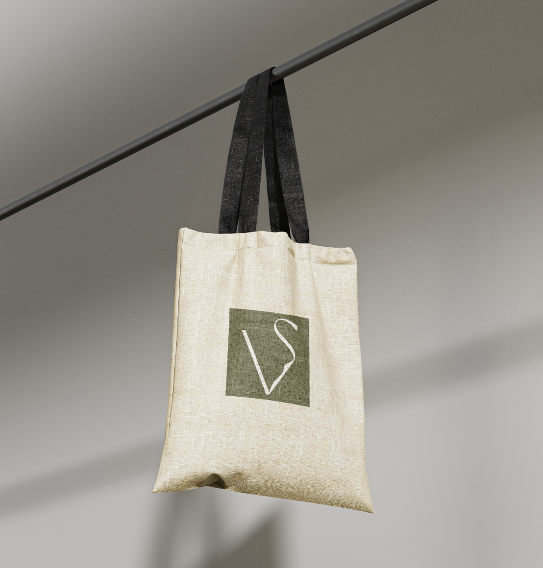
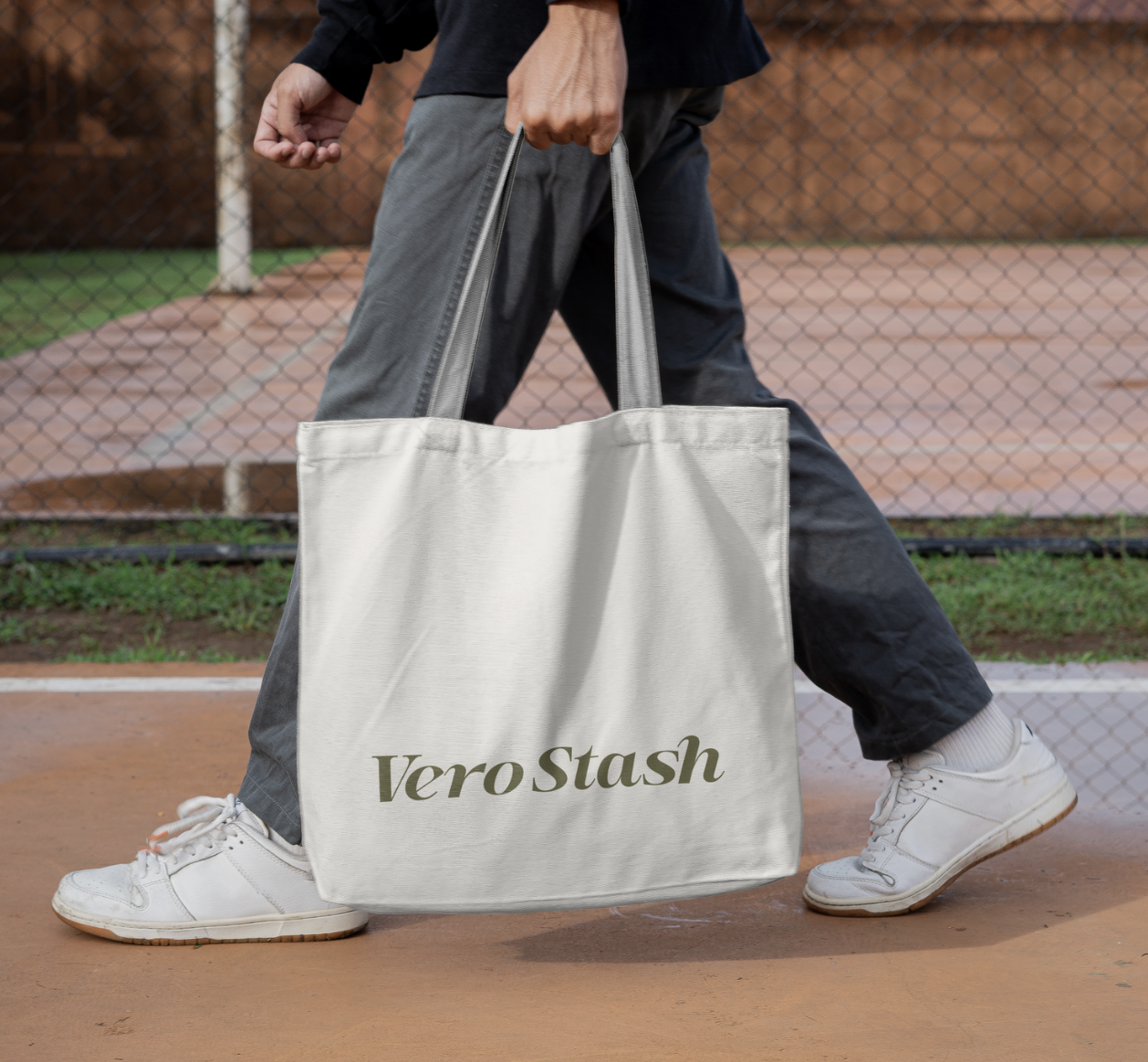
The branding extends beyond the logo—it covers packaging, social media templates, and store visuals, ensuring a cohesive experience across all platforms.
A Seamless Digital Experience
“Our goal was to create an online platform that not only looked stunning but also provided a smooth and intuitive user experience.”
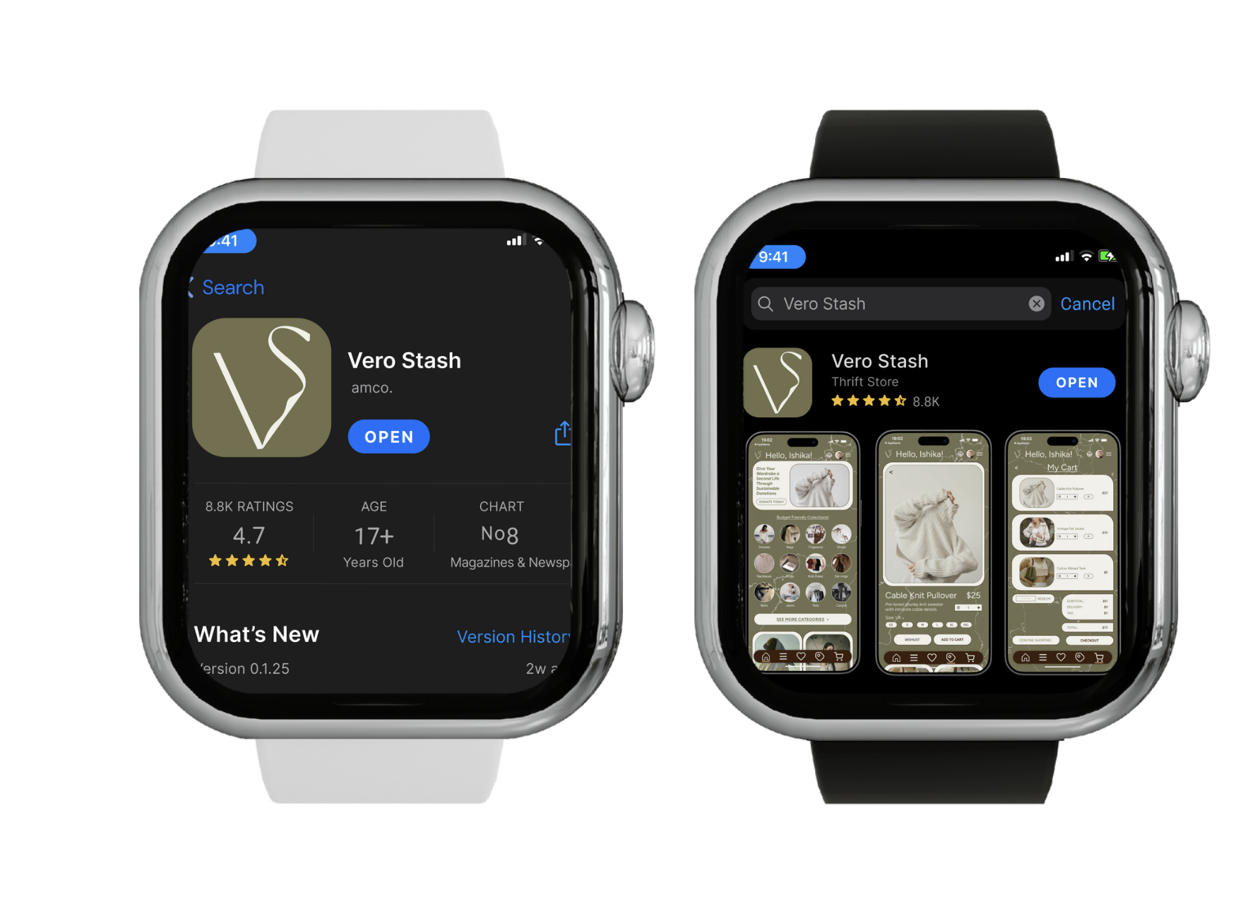
A clean, responsive design ensures seamless performance across all devices, from desktops to smartphones. Engaging animations and interactive elements capture visitor attention and keep them engaged.
Design meets storytellingThis project wasn’t just about aesthetics—it was about building a compelling narrative.
To make the thrift store’s branding feel exclusive, the design evokes the essence of a rare find rather than a secondhand piece. A blend of earthy tones, vintage photo treatments, and modern edge brought Vero Stash’s unique personality to life.
ConceptCreative Care Club is designed as a studio-led subscription model where each drop acts as an extension of ArtMonkee’s philosophy.
Instead of functioning as a product line, the system behaves more like a recurring studio output. Each box explores a specific emotional or creative state, such as feeling stuck, feeling overwhelmed, or needing to slow down. The structure remains consistent across every drop, but the content evolves. This creates a rhythm that feels predictable but not repetitive. Consistency builds trust. Variation keeps the experience engaging.
The intention is to create something that users can return to, not because they need it, but because it feels safe to. This approach also allows the system to scale while maintaining a strong conceptual foundation.
The results were TransformativeThe Vero Stash branding project was more than just a visual makeover—it was about crafting an identity that captured the essence of curated fashion with an edge. The new branding and digital presence positioned Vero Stash as a standout thrift store, blending modern aesthetics with vintage charm.
Our design strategy created a cohesive brand experience that resonates with both thrifting enthusiasts and fashion-forward individuals.
“By building a strong and unique brand identity, we helped Vero Stash cultivate a loyal community and redefine the perception of secondhand fashion.”
The website’s intuitive design and immersive storytelling enhanced user experience, increasing engagement and making shopping feel like discovering hidden treasures.
Additionally, the implementation of SEO strategies and social media integration significantly boosted Vero Stash’s online visibility, attracting a wider audience and driving customer conversions.
This project stands as a testament to the power of branding in shaping consumer perception and elevating the thrift shopping experience.