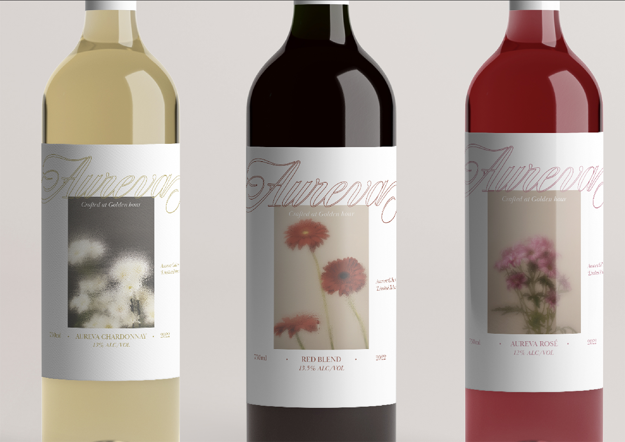
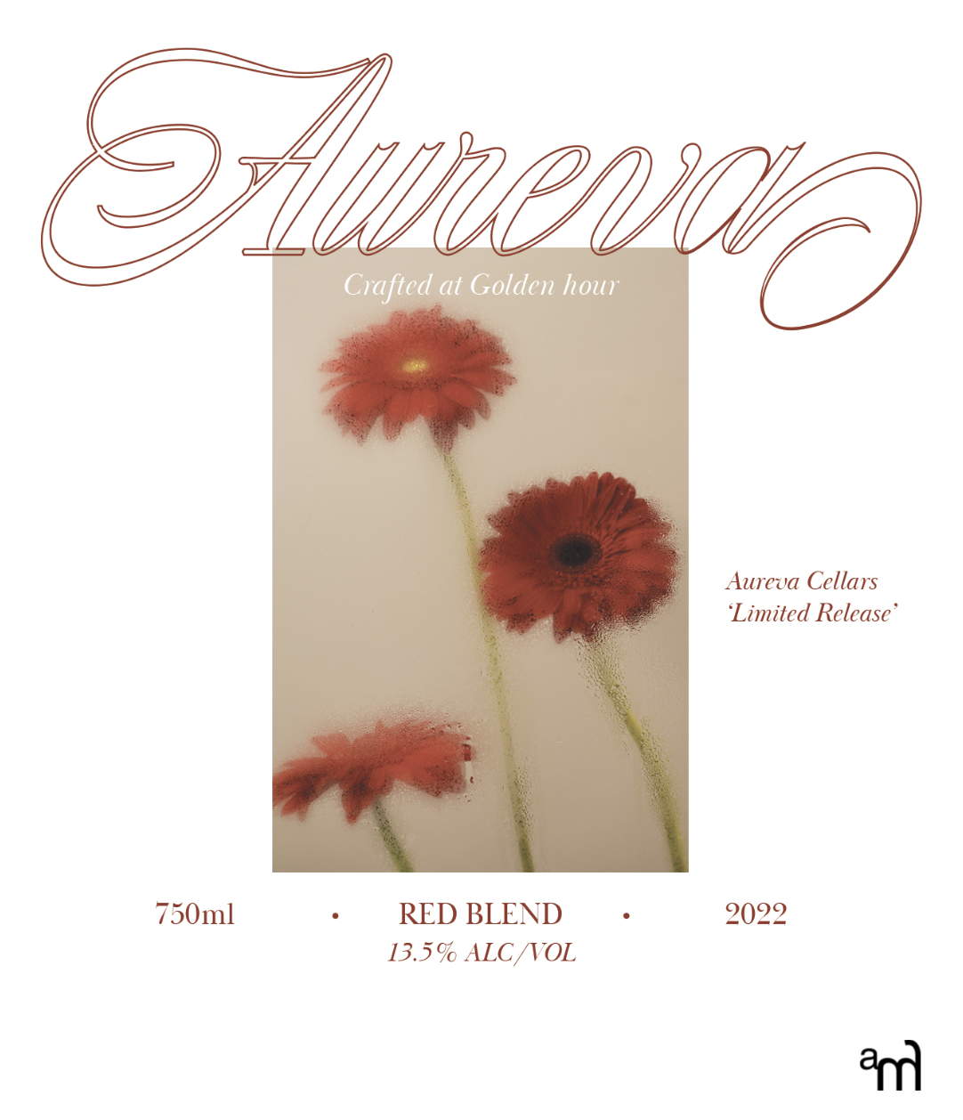
AUREVA wasn’t just about designing wine labels — it was about capturing the quiet poetry of nature in a bottle. Every curve in the typography, every brushstroke in the background, was chosen to reflect the effortless flow of the earth’s elements. We leaned into warm tones, delicate florals, and textures that felt both refined and rooted in the natural world.
A drop of wine, like a moment in nature — layered, fleeting, unforgettable.
This approach allowed the brand to stand out not with noise, but with a kind of grounded elegance that draws people in. The goal was subtle storytelling that doesn’t scream for attention but leaves a lasting impression.
We didn’t start with design — we started with sensation. What does a golden hour vineyard feel like? How does stillness taste? These abstract questions helped guide the visual identity. From sketching organic forms to selecting muted palettes inspired by soil, stone, and bloom, the process became more meditative than mechanical.
The labels tell a quiet story. The flowing forms represent time and terroir. Each bottle, a moment suspended in glass. What began as a branding exercise became a visual tribute to nature’s calm strength — a reminder that simplicity, when done with care, speaks the loudest.
In a world of over-stimulation and visual noise, AUREVA’s branding reminds us to pause. To let the quiet confidence of organic forms, muted textures, and gentle motion speak louder than excess. It’s a celebration of restraint — and proof that when you design with intention, even the subtlest choices can leave a lasting mark.


.svg)